087/ Non-Colour Colours Inspired By S/S 2024 Runways
...and how to integrate them into your wardrobe this spring.
In my last newsletter, I experimented with non-colour colours and the role they play in broadening your outfit options. That post gives the background to what I’m discussing today, so please have a read!
With spring is around the corner, I spent some time this week reviewing all of the S/S 2024 collections on WWD. Phew! When I review collections, I note what appeals to me, and what I think will appeal to my readers and clients. I consider what’s trending at the seasonal level (e.g. fringe) and, at a higher level, what the season as a whole says about the overall direction fashion is moving (e.g. the slimming of silhouettes).
In reality, most of us won’t be buying anything off the runway (see
and ’ most recent articles on this), so I’m also mining the runway for inspiration that can be applied more broadly — looking beyond the clothes themselves, and making note of the way they’re styled, as I did in a recent newsletter.With the S/S review fresh in my mind, I thought it would be a good opportunity to collage-up the non-colour colours (aka Ring 3 colours per Tibi’s colour wheel) that were favoured by designers this season, along with more accessible options you can add to your wardrobe this spring.
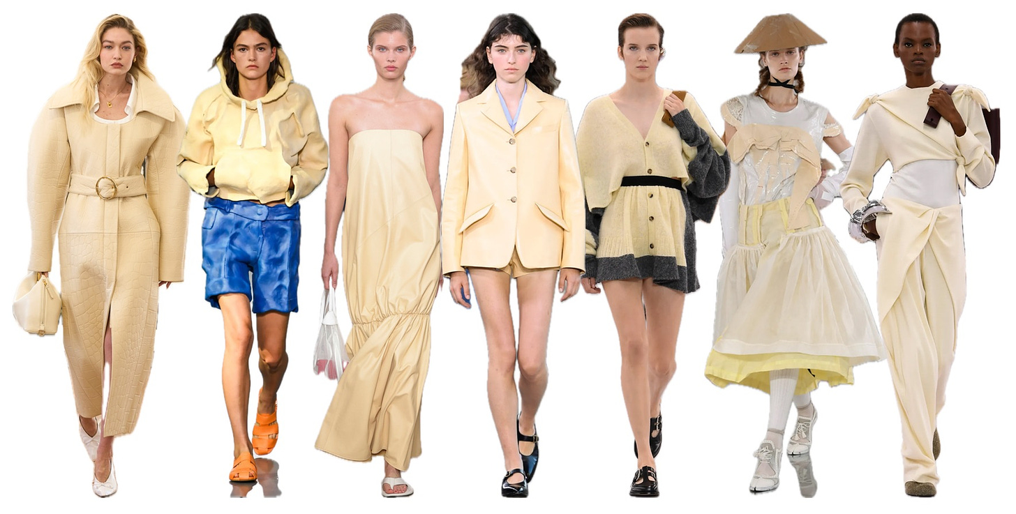
1) Pale Yellows
Any piece of clothing or accessory can be a non-colour colour, be it a sweater, blazer, shoe or handbag. As a low stakes starting point, you could try swapping out one of your neutral foundational pieces for a Ring 3 version; for instance, an oxford shirt in pale yellow in place of your go-to white.
The Zara pants I featured in my last newsletter are this shade of yellow, and I paired them with light blue and brown. To help you visualize what the colour might look like against other neutrals, I’ve added swatches from Ring 2 of Tibi’s colour wheel on the left hand side:
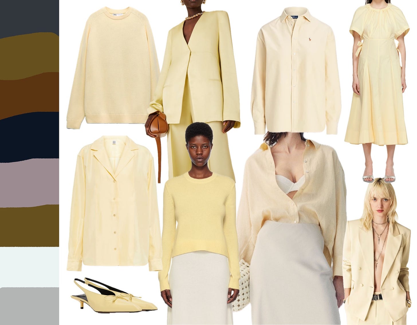
The result? Most (all?) of them could work! Pale yellow + dove grey = understated perfection. Pale yellow + slate grey = sophisticated. Pale yellow + that greyish purple = unexpected and inspired!
Interestingly, it was paired with white in 4 of 7 of the runway looks above, and it also works!
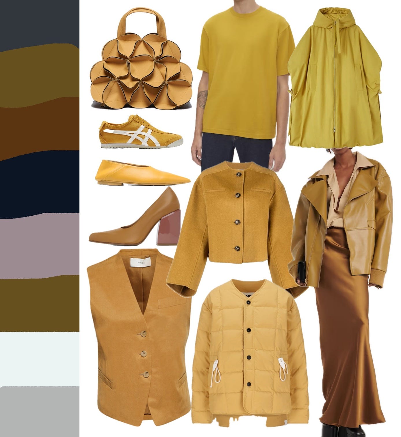
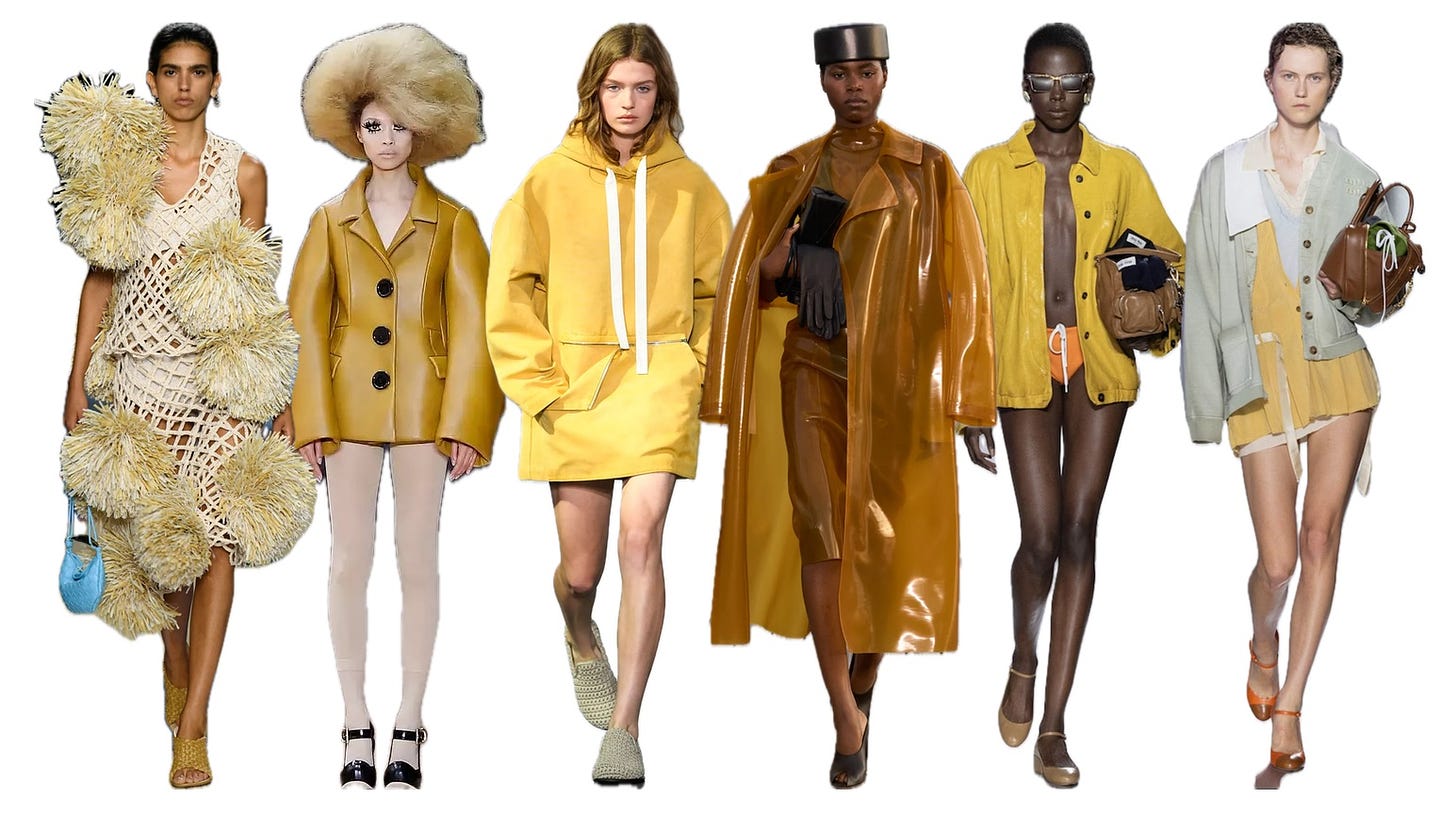
2) Mustard
The other day, someone asked me, “how do I know what colours to add to my [mostly neutral] wardrobe?” And, my answer was, “whatever colours appeal to you!”
In a recent post, Anna from The Wardrobe Edit wrote about getting her colours done, which is worth reading for her takeaways. Interestingly, her consultant said that: “most of the time, clients have already gravitated towards colours they look the best in. She’s just there to validate what we already know. It’s just part of our natural preferences.”
A note here: sometimes people tell me they can’t wear a certain colour because it doesn’t look good on them. As I wrote in a previous newsletter (about buying mistakes — always a fun topic!), my view is that most people can wear any colour (hue), but that you might feel better in some shades of that colour over others depending on its undertones and saturation.
As an example, mustard is in the yellow family, but is typically warmer and more saturated than the pale yellow above, and thus has a completely different character. If you find yourself ruling out an entire colour family altogether, it’s worth considering whether colour theory is relevant!
3) A Spectrum of Greens
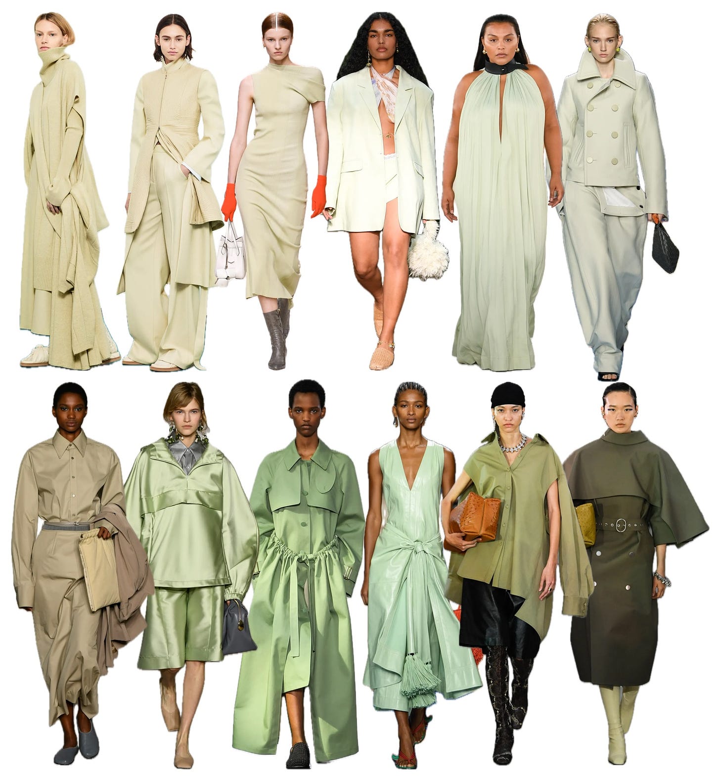
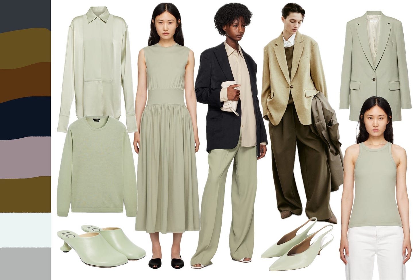
I saw so many undefined shades of green on the runway this season, but I’m going to focus on the shades in the top row, which in itself is not uniform: I see warmer undertones on the left moving towards cooler on the right. I don’t know what to call it — lichen? pistachio? — but it’s such an interesting non-colour colour; like a neutral sand tinged with just enough colour to bring subtle dimension into your outfits. Its mintier iteration is the colour of my Margiela slingbacks, of which I found two pairs on eBay (link in caption):
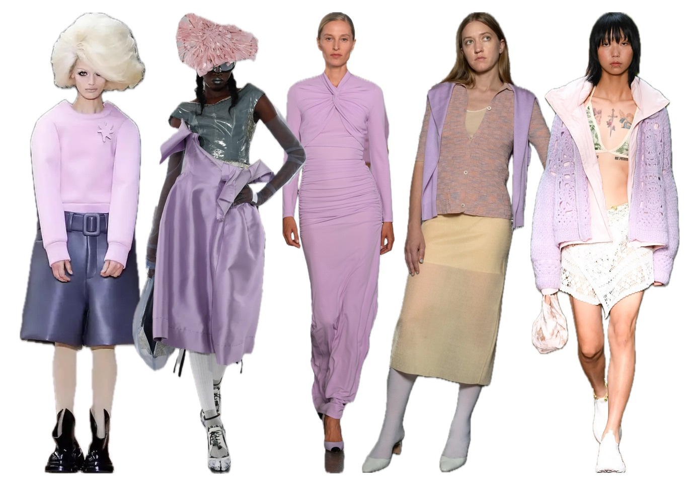
4) Cool Lilac
Ah, lilac. Such a striking colour, and the colour of my Cecilie Bahnsen skirt which I also featured in my last newsletter. As a general (personal) rule, I try not to wear cool-toned pastels next to my face because I look like the walking dead. Which brings me back to my earlier point about wearing the colours that you love. I love the colour, but I wear it as a skirt (or socks) for a good reason. For such a distinctive colour, it pairs surprisingly well against the neutrals on the left.
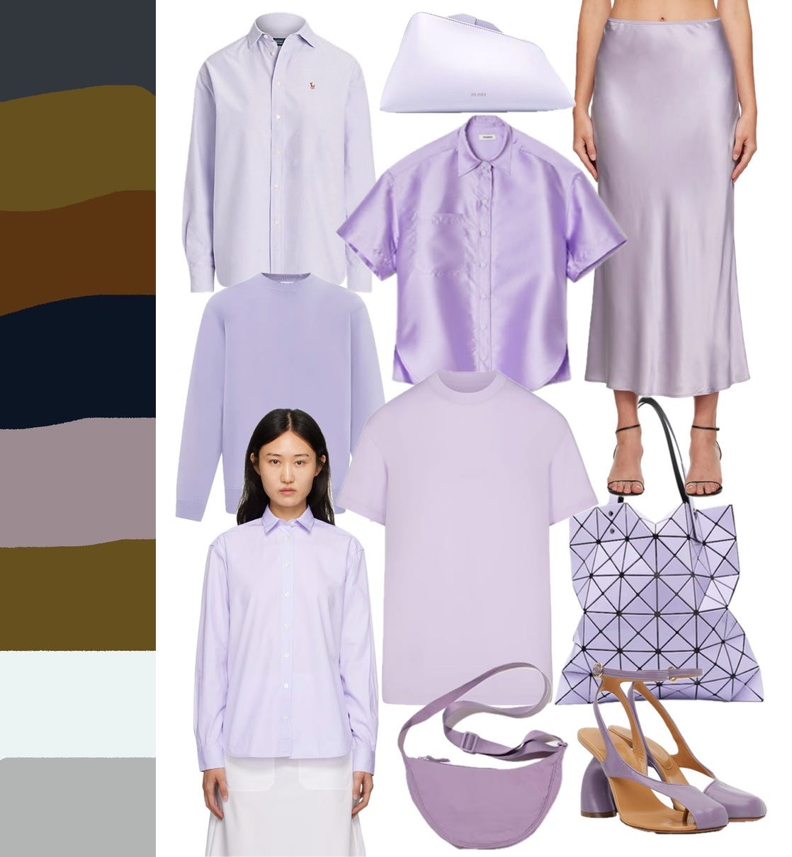
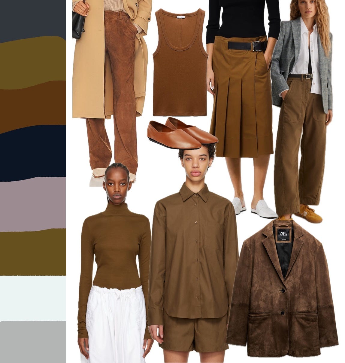
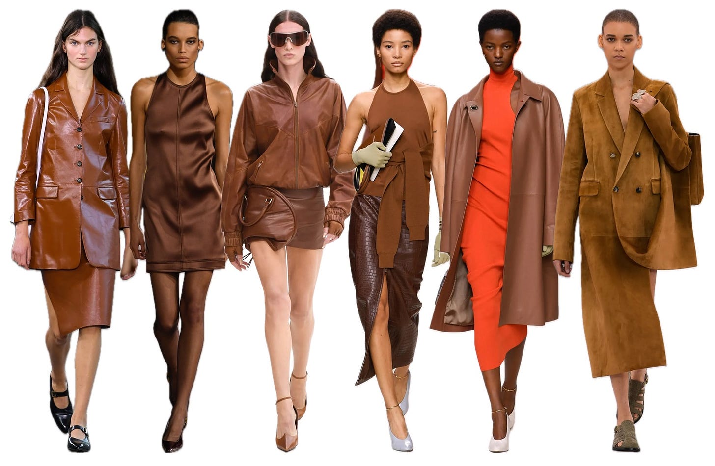
5) Milk Chocolate
The brown on S/S 2024 runways was milkier (and more red) than the dark espresso shade that was pervasive this past winter. In my work, I find brown to be the most divisive colour — you either love it or hate it! If you’re the latter, no worries, there are so many other Ring 3 colours to play with. If you love it, I hope you’re enjoying the surge of brown in the market right now!
This newsletter hit your inboxes in the wee hours of Saturday morning (Toronto time) because I’m off to Martinique with my family for March Break in T-minus four hours. I’m taking a much needed week off and will be back next week with a round-up of my vacation outfits!
Love and gratitude,
Irene


And almost all of these colors look fab with the right shade of dark olive ( especially the better yellow and mustard , well and the lilac…
I love that pale, washed-out non-green. The cooler shades remind me a lot of eucalyptus leaves. Discovering the Tibi colour wheel has made a huge difference in how I think about pairing colours, opens the eye up to SO many more outfit options!